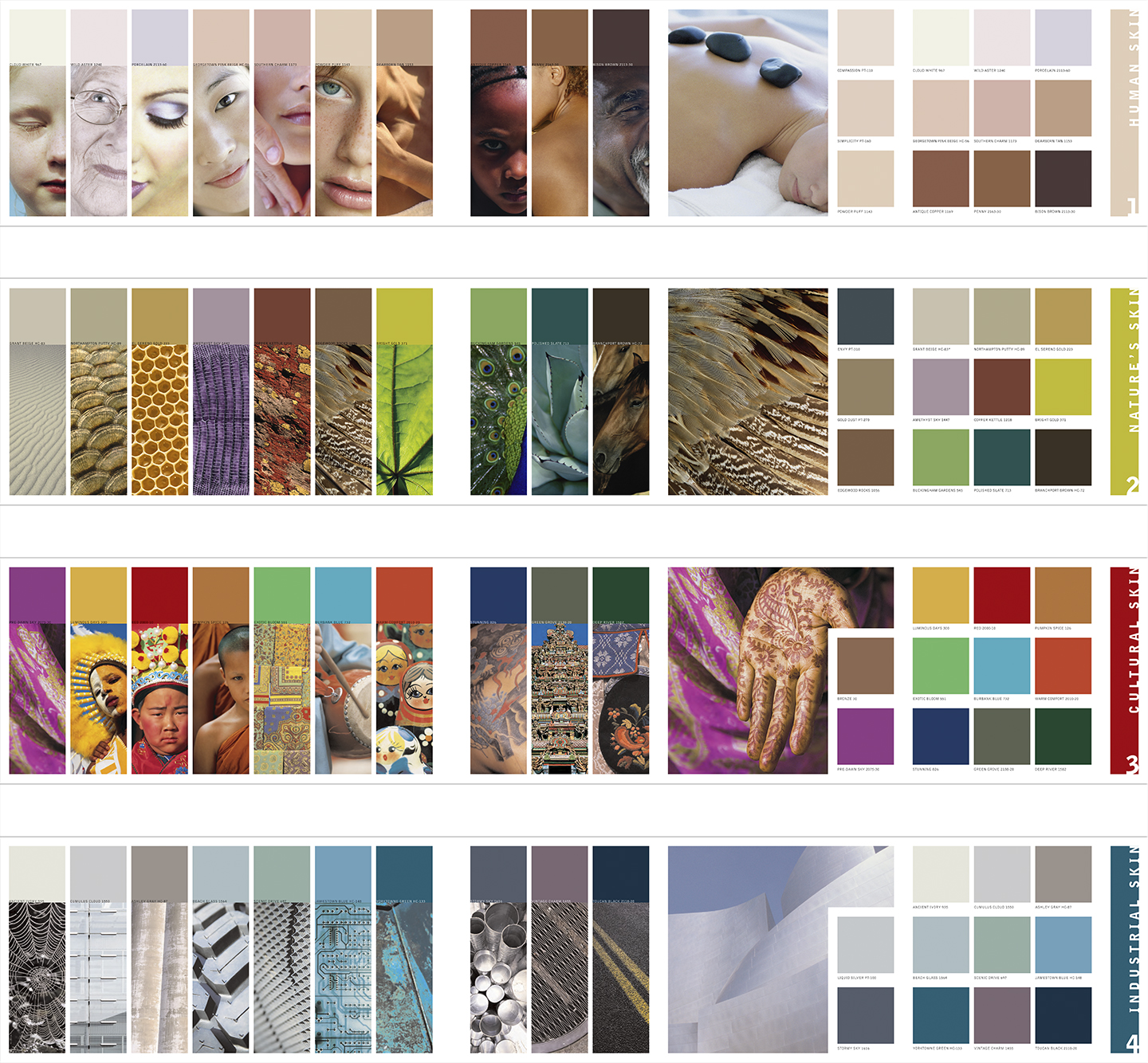
Benjamin Moore Color Pulse®
- Integrated Marketing
- Brand Identity
- Brand Strategy

The annual color trend forecast Color Pulse® for Benjamin Moore was a high-concept marketing vehicle designed to reposition the premium brand known for historical and classic paint colors for a trend-forward market. For eight successive years, each multilingual edition communicated an overarching trend and supporting themes with sourced imagery and Benjamin Moore-specified paint colors. Our creative director visualized the trends identified by the client’s director of color and design with an innate understanding of the underlying concepts and a keen eye for interpretation. The publication received numerous Sappi awards and international recognition among architects and designers across industries.